Drac Màgic
Client
Drac Màgic is a social initiative cooperative founded in 1971 and dedicated to study and disseminate audiovisual culture in Spain
What we did
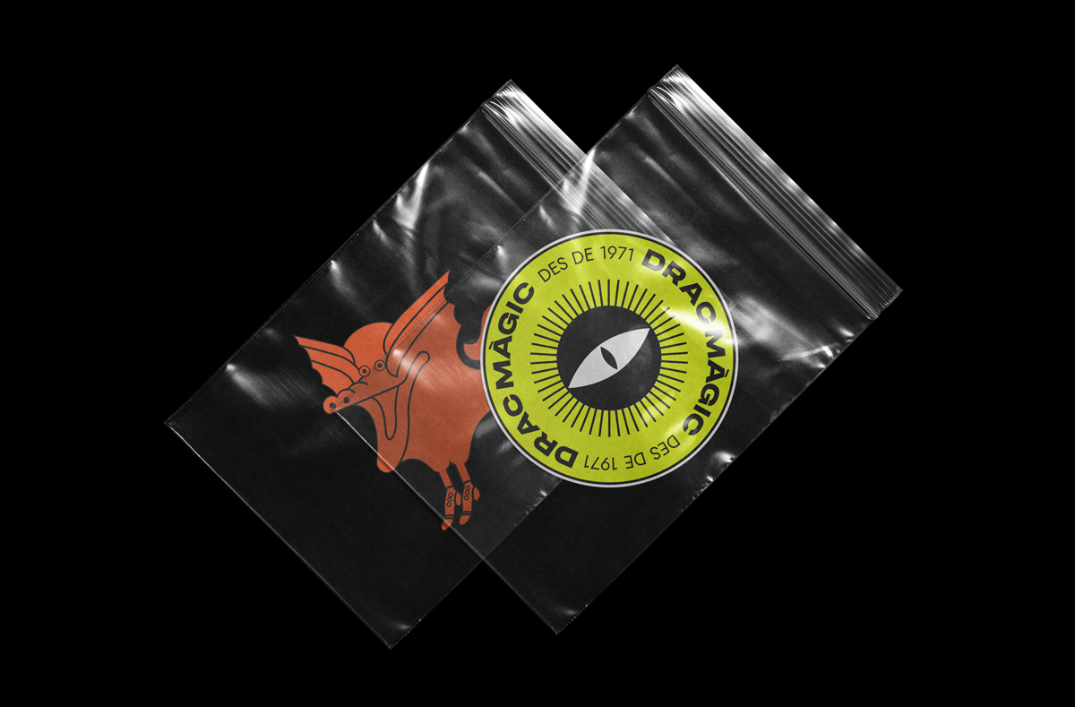
The Drac team contacted me to work on the re-branding of their association for their 50th anniversary. We worked together to figure out what they wanted to say and how. Drac Màgic means Magic Dragon in catalan and the team wanted to keep an idea of the dragon imagery but at the same time separate themselves from something too specific. So we worked on this idea of the eye of a dragon looking through a lense. This way we talk about an audiovisual POV with a special and differentiating image.
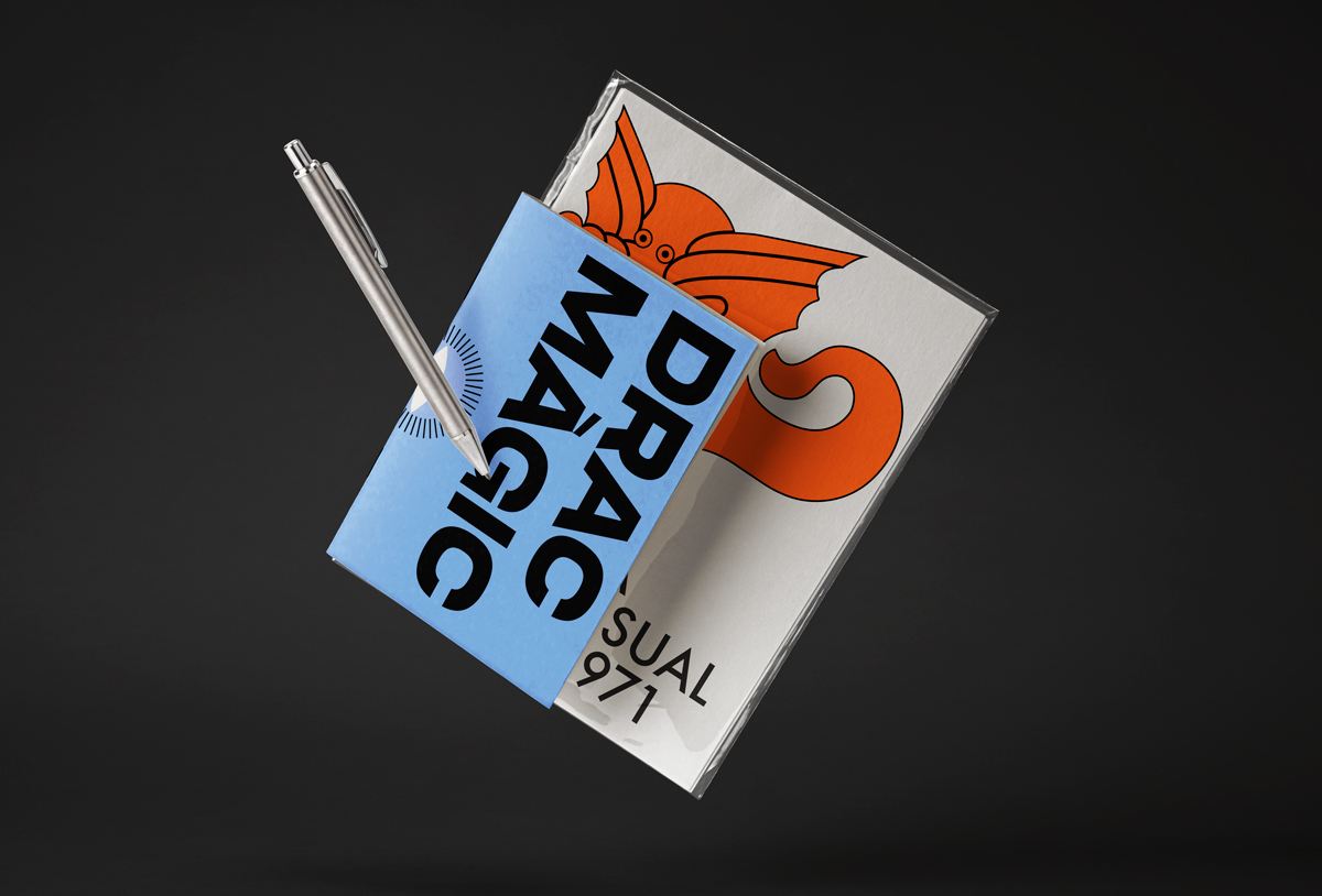
We made many versions of the logo to be applied on different formats, digital, print, paper, screen… while pumping life into the design with eye-catching colors that represent the four pillars of their work: feminism, activism and education.
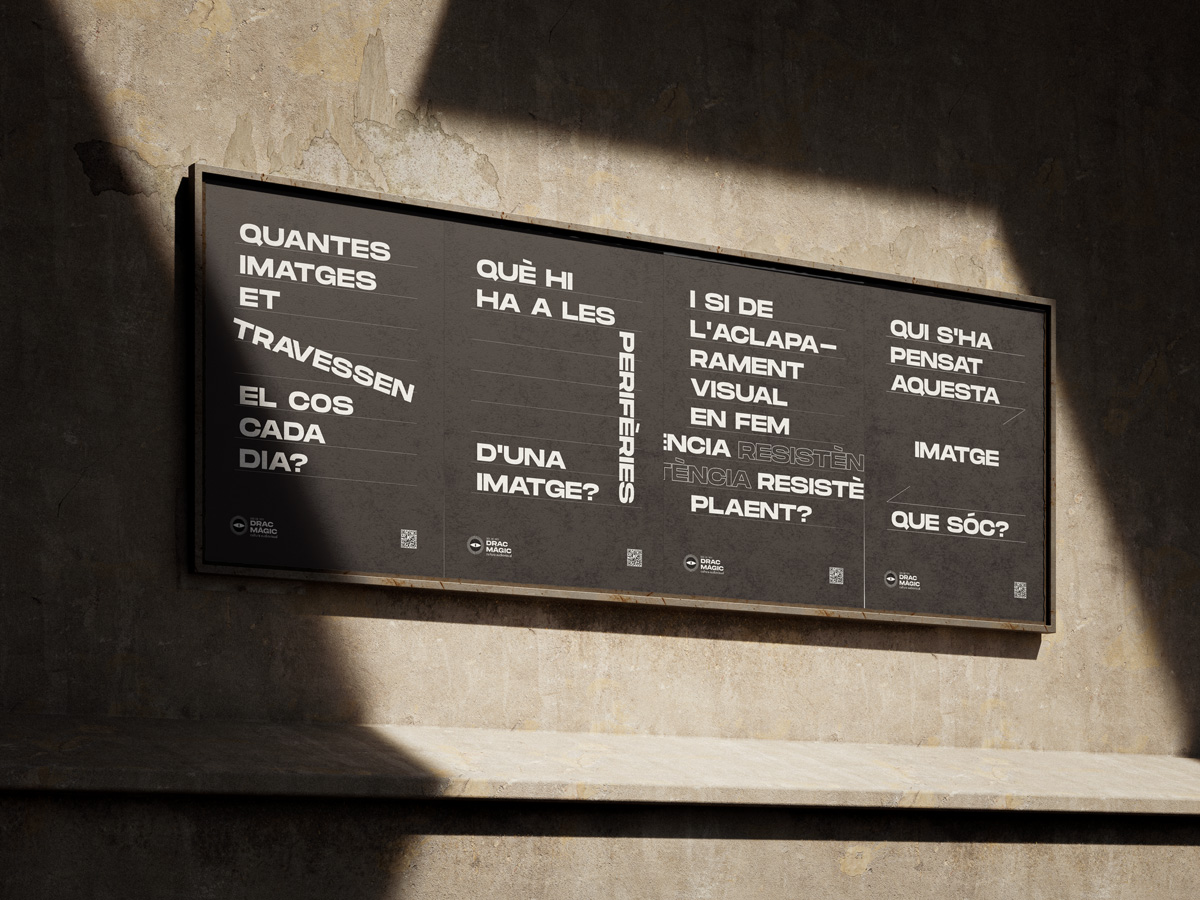
To complete the project we also designed A1 posters for a small street campaign dedicated to presenting the 50 years of Drac Màgic. The presentation of the new identity was unveiled during an event for the anniversary at La Filmoteca de Catalunya.