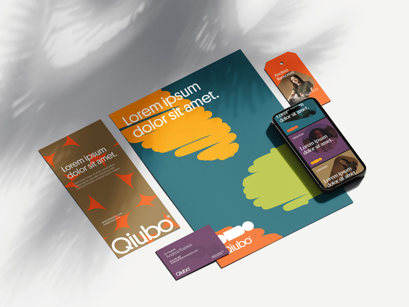
Quibo
Client
Qiubo® is a conceptual project for a start-up for connecting students with experts in different areas for online master classes.
Project
Identity and digital applications for their masters thesis
Solution
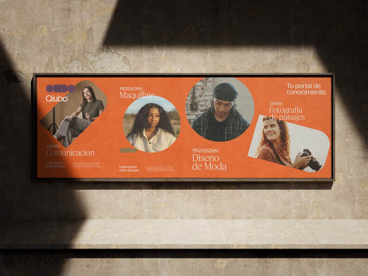
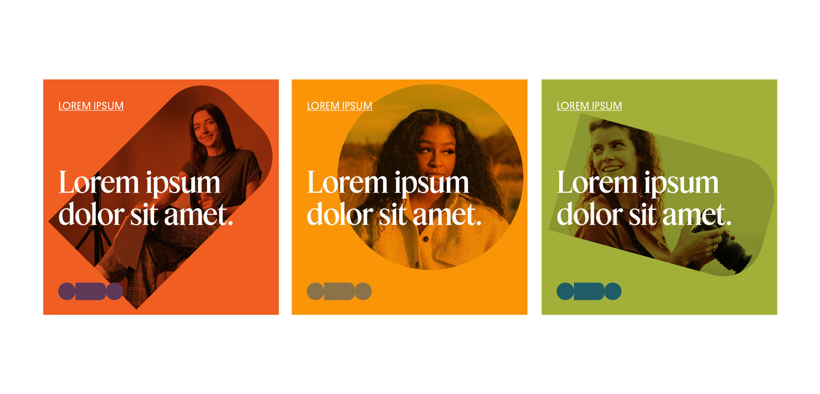
Working closely with Qiubo co-creators, Maria and Sebastián, we developed the first stage of identity and digital applications for their product. Based on the concepts of communication, learning and transfer of knowledge and community we used friendly and vibrant colors and typography for a eye-catching identity.
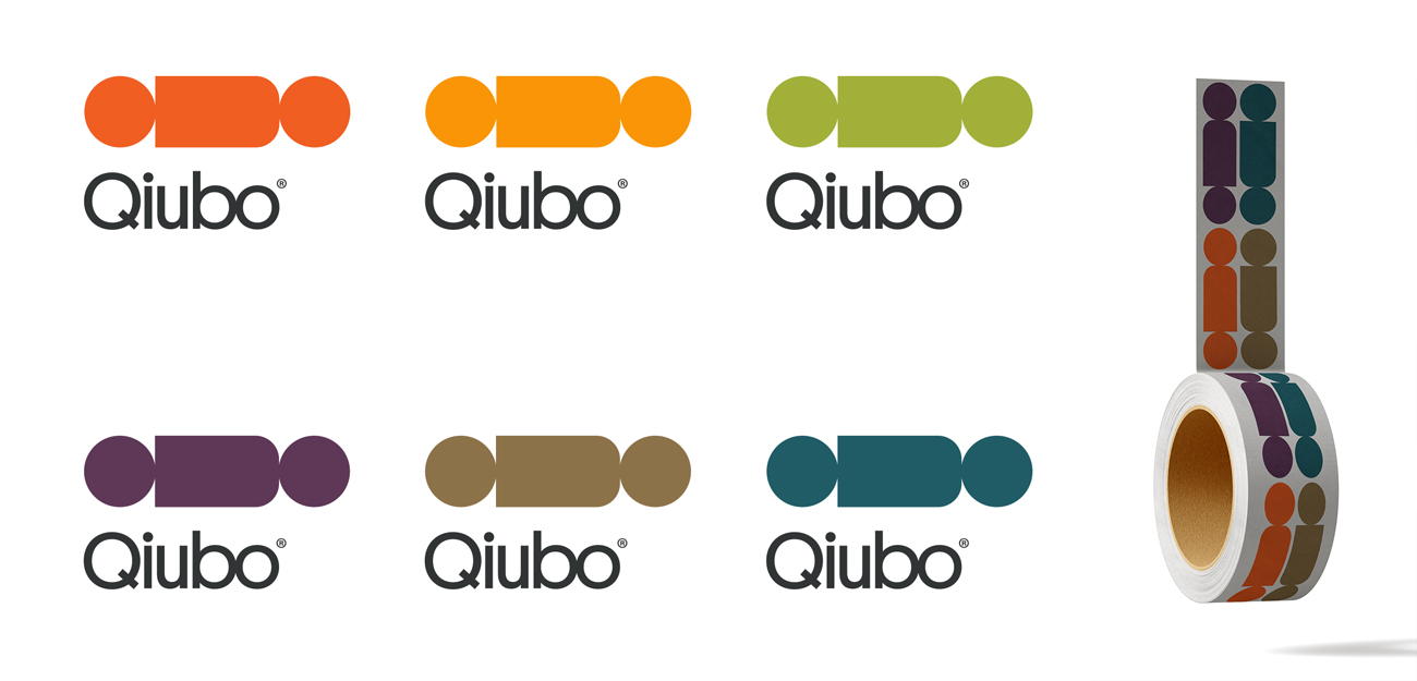
When they came to me with the brand name (a visual form of the chilean saying “¿Qué hubo?” which would translate to “What’s up?”) we decided to create a logotype that would incorporate the idea of speech and the sharing of concepts. So by using the shape of the word, I created an abstract shape that resembles both a speech bubble and points that connect from a starting point to an end. We wanted to represent the idea of growth with a clear goal at the end of the process.